Skip to content
  • There are no suggestions because the search field is empty.

Understand the graph in Ads Manager

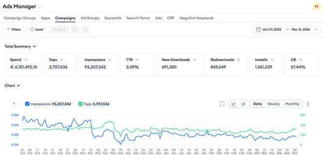
Above the data table on every layer in Ads Manager, a performance graph displays metric trends over the selected date range. 

This article explains how to read the graph, use the Total Summary cards to choose which metrics appear, understand how the chart adjusts its axes, use the chart view controls, and reset the view.

If you want to learn how to set the date range or compare two time periods, see Use time selection and compare periods in Ads Manager.

What the graph shows

The graph plots the metrics you select as lines over time. By default it shows Impressions and Taps. You control which metrics appear using the Total Summary cards above the graph, described below.

How the graph arranges its vertical axes depends on the Compact Axis checkbox above the table.

Compact Axis is checked by default. In this view, the graph groups your plotted metrics into up to three Y-axes based on value type: one axis for currency metrics, one for percentage metrics, and one for number metrics. Metrics that share a value type share an axis, which keeps the chart easy to read even with several metrics plotted.

When you uncheck Compact Axis, the graph displays a dedicated Y-axis for each plotted metric, up to eight axes. Each axis uses the same color as its metric’s line, so you can match every line to its own scale at a glance. This view is useful when you want to read exact values for metrics with very different ranges.

Your Compact Axis preference is kept as you move between layers, switch between the line and bar chart, or change the chart granularity, so the graph stays in the view you chose throughout your analysis.


Above the graph, the Total Summary section displays eight metric cards, each showing the total for the selected metric for the selected date range. Every card has a checkbox in its top-left corner: checking a card plots that metric on the graph, and unchecking it removes the line. The checkbox color matches the metric's line on the chart, so the cards also act as the graph's legend. The Total Summary updates whenever you change the date range or apply a filter.

Change the metrics shown

You control the graph from the Total Summary cards in two ways: by checking cards to choose which metrics are plotted, and by changing which metric a card tracks.

Plot or remove a metric by checking or unchecking its card. You can plot up to eight metrics at once, so every Total Summary card can appear on the graph at the same time. At least one metric must stay checked at all times, so when a single metric is left, its checkbox locks and shows “1 metric must be selected” until you select another.

Change a card's metric using the dropdown on the card. The dropdown includes a search field and groups metrics into categories: Insights, Ad Performance, In-App Conversions, Cohort Analysis, and Custom Columns. Custom columns are available here by default, with no need to add them to the data table first.

Every metric is selectable at each layer. If a metric can't be shown in your current context, for example because it needs a goal selected, isn't available at the current layer, or doesn't apply to the selected time basis, the card shows a warning icon and the metric stays selected on the card but isn't plotted on the graph.

A metric that's already active on another card appears greyed out in other dropdowns with the tooltip “This metric is already selected,” so each metric maps to a single card.

A Reset control in the Total Summary area returns the cards to their default view. It appears once you've changed the default selection.

Adjust chart granularity

On the right side above the graph, three buttons let you change the time granularity of the data points: Daily, Weekly, and Monthly.

Daily shows one data point per day and is the default view. It gives you the most detail and is best for spotting short-term fluctuations or the effect of a specific change.

Weekly groups data into weekly totals or averages and is useful for identifying week-over-week trends without daily noise.

Monthly groups data into monthly totals and works best for longer date ranges where daily granularity would make the chart difficult to read.

Use the chart view controls

To the left of the Daily/Weekly/Monthly buttons, a set of small icons gives you additional chart controls.

The line chart icon is the default view and plots metrics as continuous lines over time.

The bar chart icon switches the graph to a bar chart format, which can make it easier to compare values across discrete time periods.

The Data Labels option adds the numeric value directly onto each data point, so you can read exact figures without hovering.

When you hover over the chart, the tooltip lists every plotted metric for that date, color-matched to its line.

How the graph responds to filters and selections

The graph always reflects the current state of your table. 

When you apply a filter, the graph updates to show only the data matching that filter. When you select specific rows in the table using the checkboxes, the graph updates to show only the performance of the selected items. This makes it straightforward to isolate a single campaign or ad group and see its trend without changing your overall view.

When you enable the Compare toggle in the date picker, the graph shows both periods for each plotted metric. Each metric keeps a single color across both periods, and the two periods are distinguished by style rather than color: in line view the current period is a solid line and the comparison period is dashed, and in bar view the current period is solid while the comparison period is hatched, with the two bars grouped side by side. See Use time selection and compare periods in Ads Manager for more on how comparison mode works.

Your metric selections carry over as you move between layers. If a metric you've plotted isn't available at the layer you switch to, it's unchecked and removed from the graph, and its card shows a warning.

If a data point is missing for a date, the graph treats it as zero. When you select a single day, the graph shows a data marker for that day instead of a line.

Layer-specific charts

Alongside the graph above the table, individual rows carry their own charts. Hover a row and a chart icon appears next to the row name or next to the value in certain columns. The icon is shown only where there is data to plot, and which charts are available depends on the layer you are viewing.

Hourly Data: Available at the Campaign, Ad Group, and Keyword levels. The chart icon next to the row name opens the hourly breakdown for that row, which is useful for spotting intraday patterns that daily granularity hides.

Daily Budget History: Available at the Campaign level. The chart plots Daily Budget, Average CPT, Conversion Rate (Total), and Attributed Installs by default, and the plus button adds more metrics. Reset returns the chart to its default metrics. Arrows at the top move to the previous or next campaign without closing the modal. Below the chart, the Daily Budget History table lists each budget change with its source, new budget, old budget, and update time. Source shows Dashboard for changes made in Ads Manager and Budget Allocation for changes made by that feature.

Ads Performance: Available at the Ad Group level. The chart shows the top five performing ads in the ad group by conversion rate, with Impressions plotted. A link in the modal opens the performance of every ad attached to the ad group. Below the chart, the Ads Performances table lists each ad with its storefront, tap-through rate, and conversion rate.

Bid History: Available at the Keyword level. The chart icon next to Bid Amount opens the Bid History chart for that keyword, with the keyword name at the top and arrows to move to the previous or next keyword without closing the modal. Bid Amount is plotted by default. Use the plus button to add more metrics, grouped into Settings, Ad Performance, and Custom Columns, including Impression Share (First Ad Position). Below the chart, the Bid History table lists each bid change with its source, new bid, old bid, and update time.

Keyword Ranking: Available at the Keyword level. The chart icon next to Organic Rank opens the Keyword Ranking chart, titled with the keyword name in parentheses. Organic Rank is plotted by default, and the plus button adds further metrics from the same groups, including Impression Share (First Ad Position), so you can read paid visibility against organic position for the same keyword. A storefront dropdown in the top right sets which country the chart covers.

Daily Impression Share History: Available at the Keyword and Search Term levels. Both Impression Share columns carry a chart icon inside the cell. The icon in an Impression Share (First Ad Position) cell opens the Daily Impression Share (First Ad Position) History chart, and the icon in an Impression Share (All Ad Positions) cell opens the Daily Impression Share (All Ad Positions) History chart. Each is titled with the keyword or search term it covers, and neither has a metric selection. Values above 90% are plotted at the median of the 91 to 100% range, and values Apple returns as a single figure are plotted at that exact point. The charts are available to Apple Ads users; freemium users see a PRO badge when they click the icon. At the Search Term level the icon is disabled for low volume terms, because Apple does not provide Impression Share data for them.

These charts open with the date range selected in Ads Manager and can be switched between line and bar view and between Daily, Weekly, and Monthly granularity. Changing the date range inside a chart does not change the date range of the table behind it.

Related links


Need more help?

If you have further questions, contact your dedicated Customer Success Manager or reach out via live chat.