
The Total Impression Share chart in Search Result/Keyword plots how paid visibility is split between advertisers for a given keyword within the selected date range. Use it to spot which apps are gaining or losing ground.
Read the chart
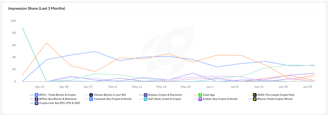
Each line on the chart represents one app bidding on the keyword, and the value at any point shows that app’s Total Impression Share on that date. The legend below the chart maps each line to its app.
Keep in mind!
Total Impression Share is calculated across available search results placements. It is not the sum of 1st Placement Impression Share and 2nd Placement Impression Share.
What to look for
- A sustained line near 100% means one app is dominating paid impressions for the keyword.
- A drop in an app’s line often signals new competitors entering the auction, or a budget or bid change.
- New lines appearing partway through the date range indicate apps that recently started bidding on the keyword.
- Lines crossing one another show shifts in competitive position, where one app has overtaken another in paid visibility.
Compare with the apps table
Use the chart alongside the apps table below it. The chart shows movement over time, while the table shows Total Impression Share, 1st Placement Impression Share, 2nd Placement Impression Share, Apple Ads Visibility Score, organic rank, and total paid keywords for each app competing on the keyword.
Related links
- Analyze a keyword’s competitive landscape
- Read keyword performance metrics
- Review the apps ranking for a keyword
- Set the region and date range
Need more help?
If you have further questions or run into any issues, reach out to your dedicated Customer Success Manager or contact the support team via live chat.